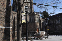
I do hope that we will soon hear the “good news” concerning the University Center renovations, being that the administrators will after all not tear down the beautiful 1958 addition and then place up two large modern parallel wings running uphill.
The proposal is to a fair degree audacious and risky as it is questionable whether it will work well and be attractive. Additionally, the plan carries the large negative of eliminating a structure which already is reasonably handsome and serving well.
For example, look at how appealing the Asa Packer Dining Room is now, that is to say, functioning as a dining commons. Why should we want to change this?
The new generation simply should not be so easily allowed to re-interpret old buildings and institutions in the manner they like, almost at will, because they appear outdated or somehow out of touch. Structures do not have to be new, or have the latest styles, to be valuable. Yes, there exist some good ideas indeed, however, change merely for the sake of seeing something different is not very logical.
Saying “no” in the face of calls to action or compromise are among the best decisions we can sometimes make. I wish the administrators here will realize this, and take a more balanced and moderate perspective in regard to the University Center and our campus plans generally.
John G. Lewis ’90
New London NH


Comment policy
Comments posted to The Brown and White website are reviewed by a moderator before being approved. Incendiary speech or harassing language, including comments targeted at individuals, may be deemed unacceptable and not published. Spam and other soliciting will also be declined.
The Brown and White also reserves the right to not publish entirely anonymous comments.
3 Comments
Hear, hear!
Lehigh Architects: what is the structure, looks like a brick arch, on top of the roof on the east end, nearest to the library, of the UC?
Preserve arcilhitecture of UC but tear down Trembly Park ugly buildings & Replace.