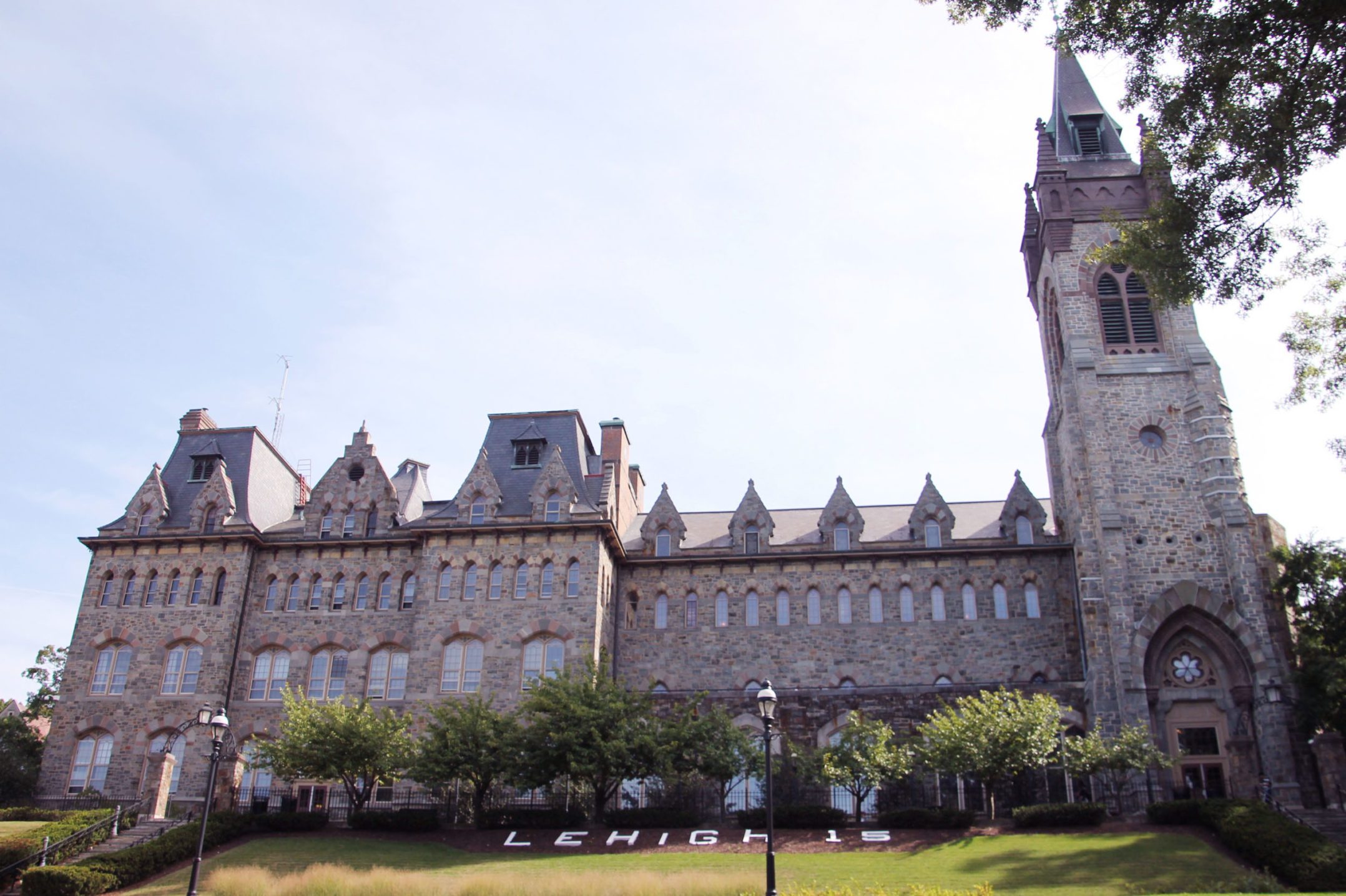
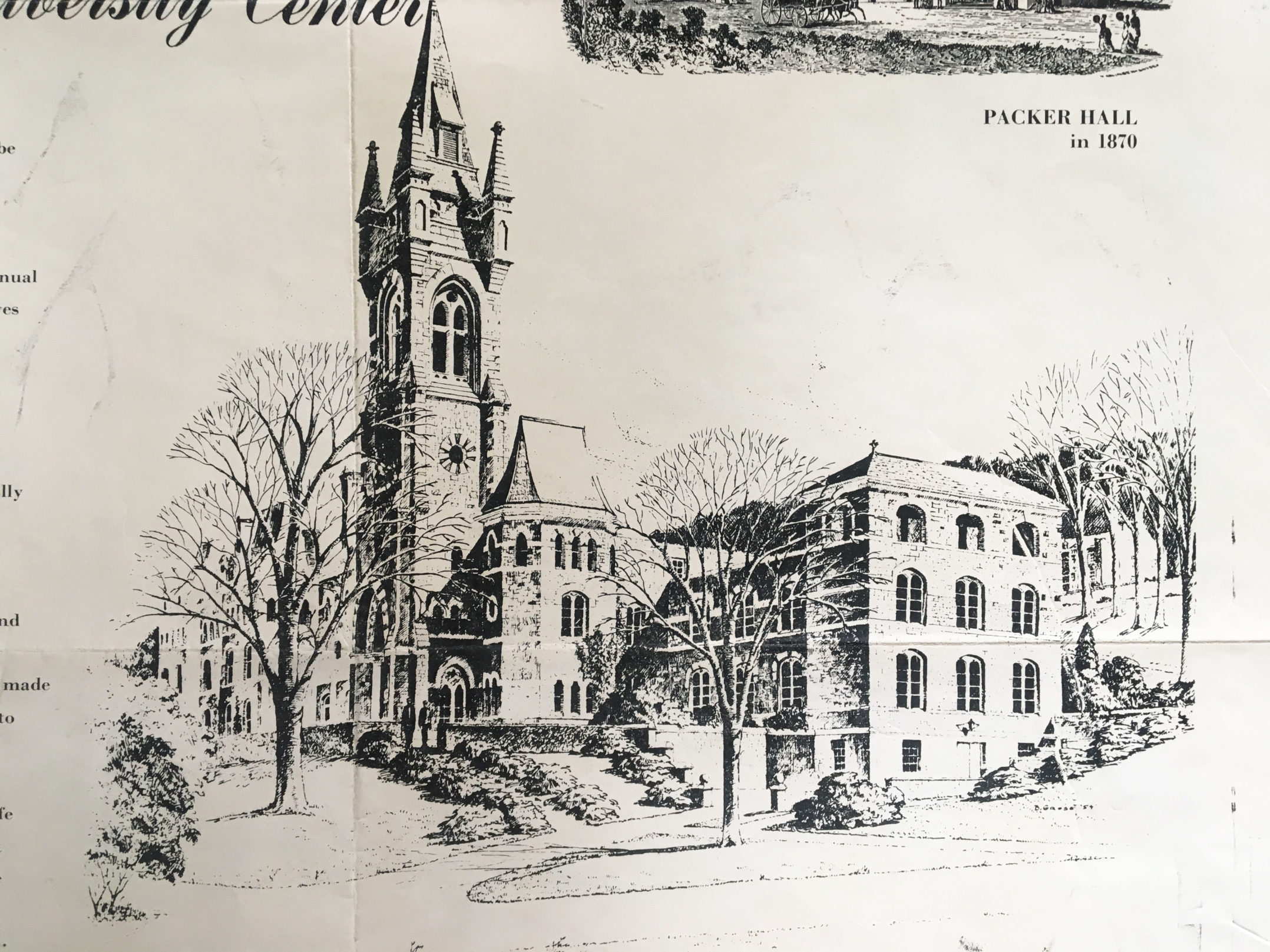
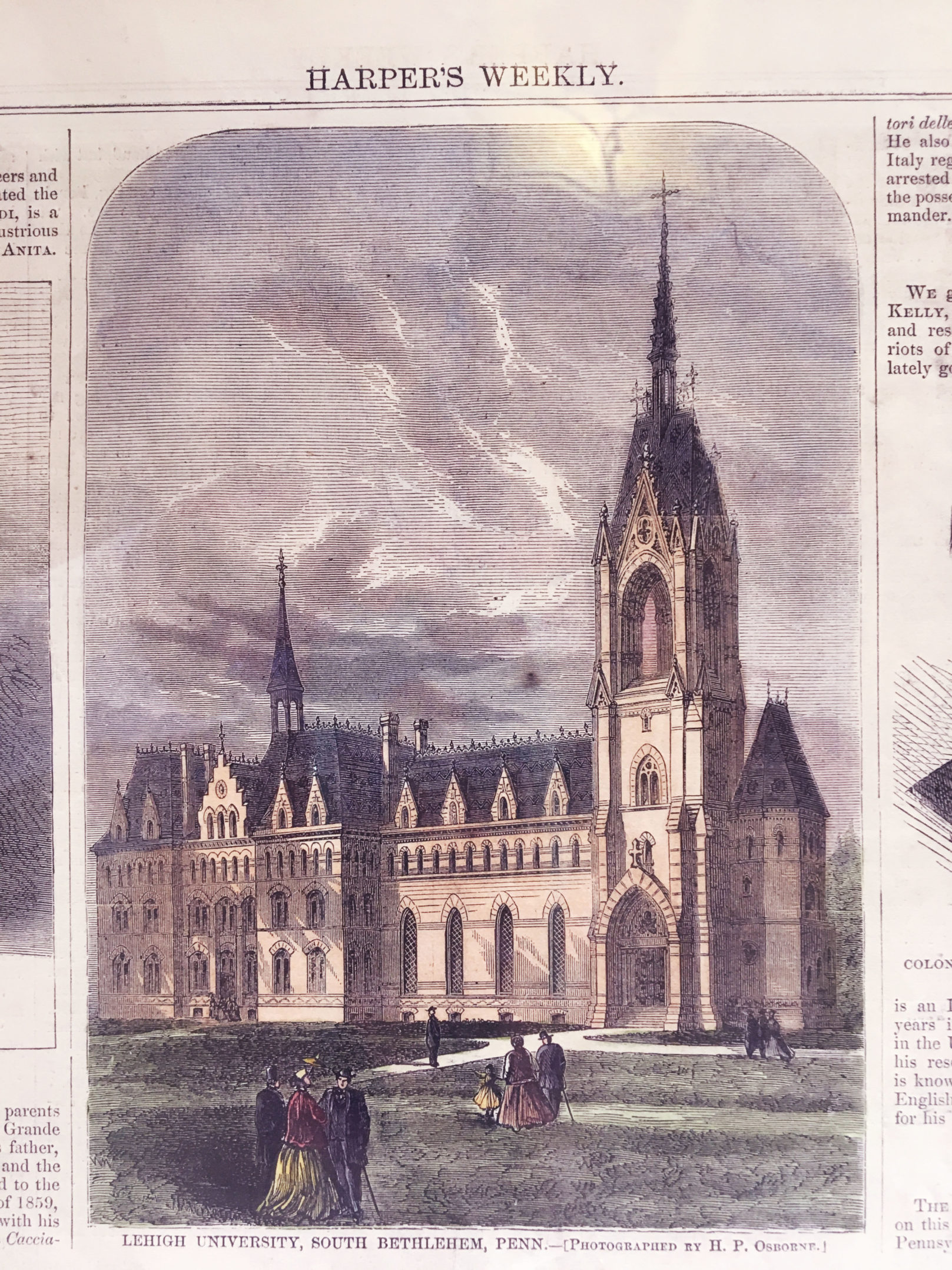
The Lehigh University Center, formerly known as Packer Hall, stands proudly in the center of Asa Packer Campus. The structure was built in 1869 and has been home to a multitude of student activities and purposes for the past century-and-a-half.
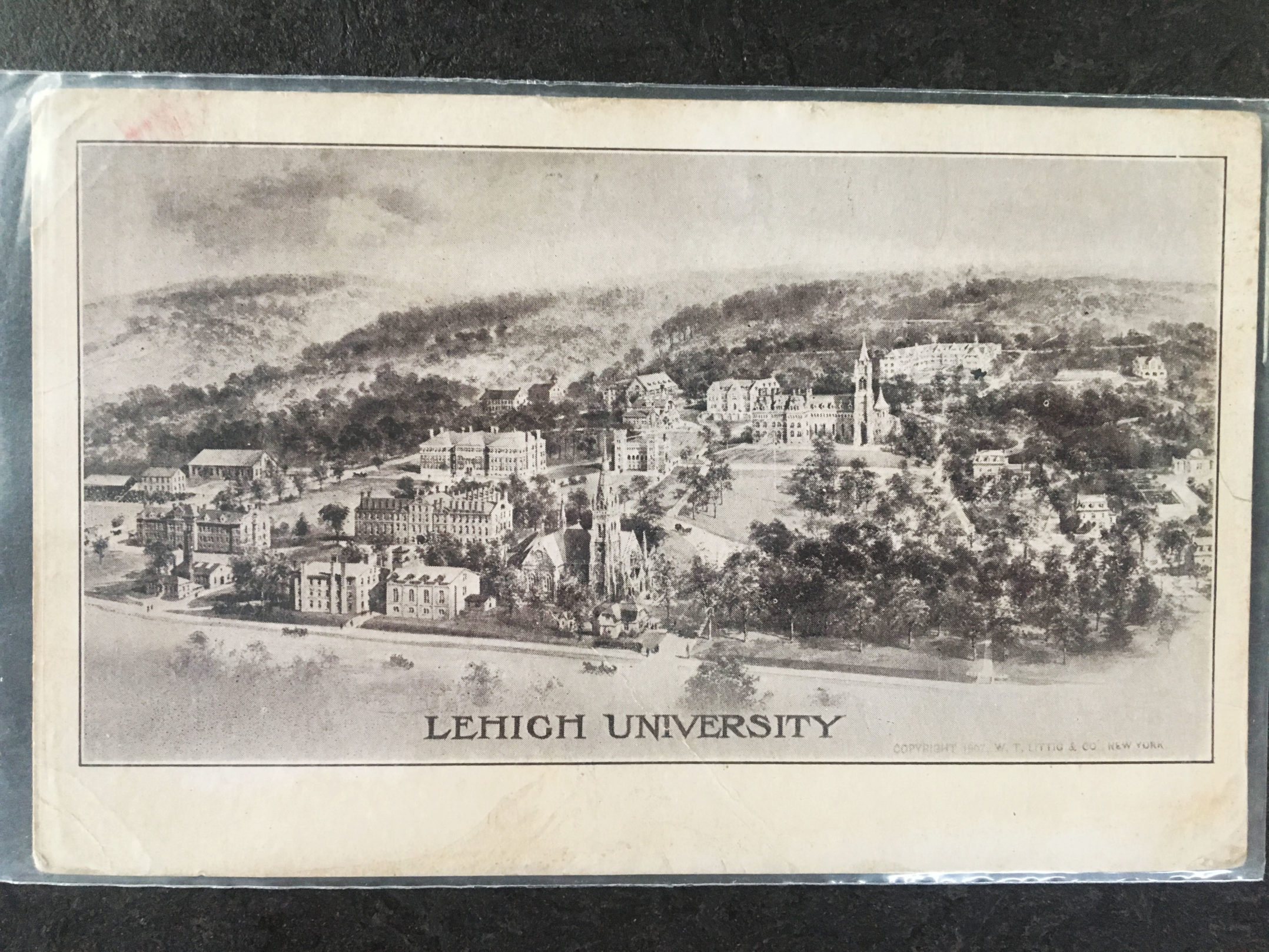
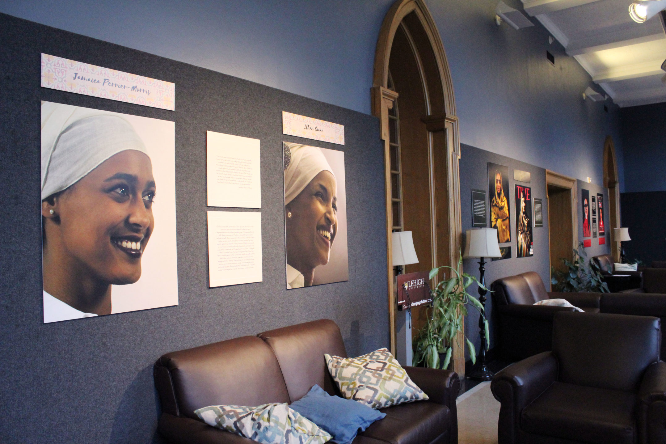
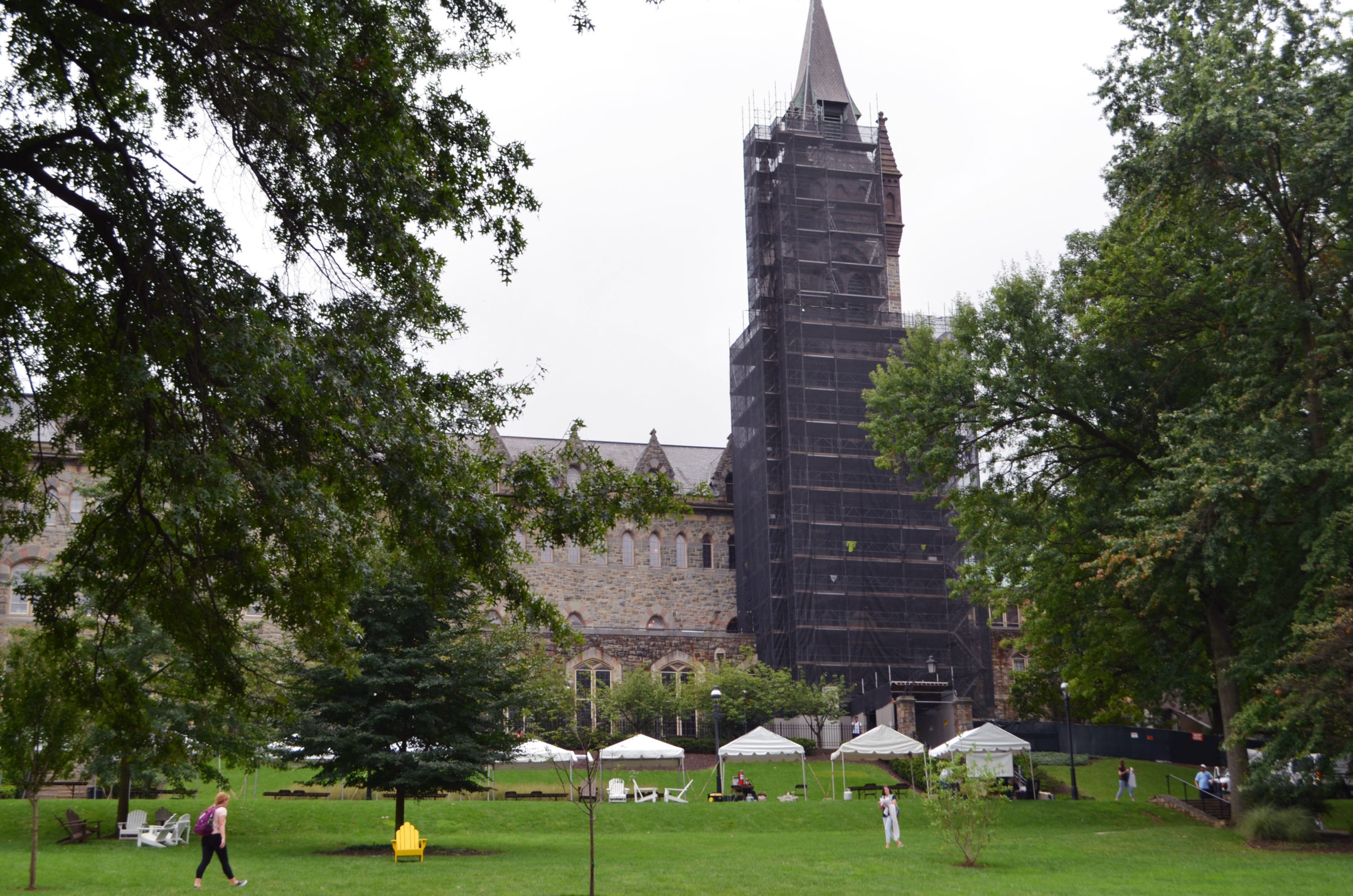
As Lehigh has grown and changed over time, the structure has done the same through renovations and internal re-purposing. The following photos serve as a digital timeline of the building’s history as well as plans for its renovation as part of Path to Prominence.
Ilhan Citak, a special collections and archives librarian at Lehigh, and Brent Stringfellow, an associate vice president of facilities and the university architect, spoke with The Brown and White about the history behind the UC and how it came to the symbol students recognize today.





Comment policy
Comments posted to The Brown and White website are reviewed by a moderator before being approved. Incendiary speech or harassing language, including comments targeted at individuals, may be deemed unacceptable and not published. Spam and other soliciting will also be declined.
The Brown and White also reserves the right to not publish entirely anonymous comments.
9 Comments
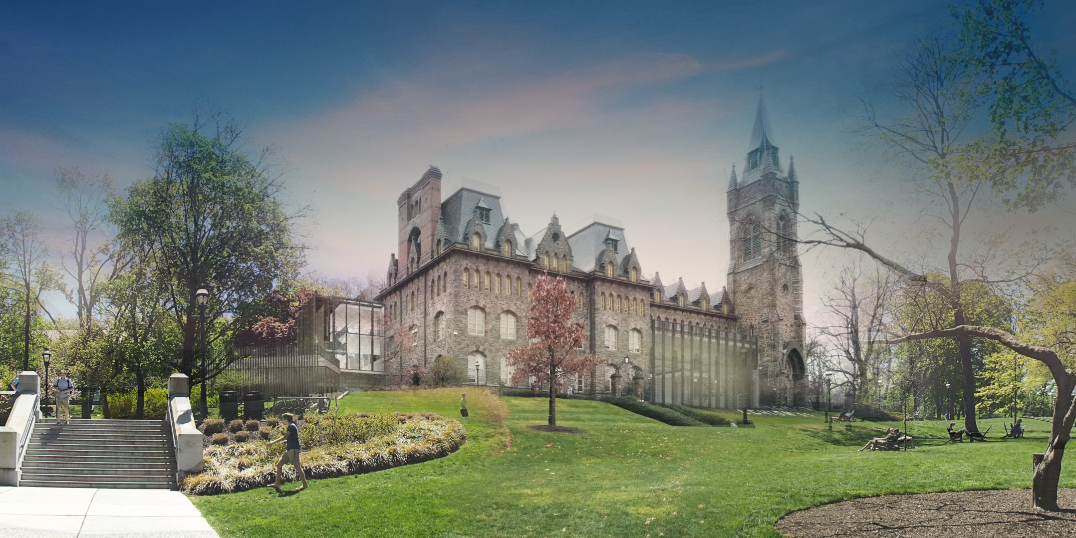
The glass additions to this building is a blatant architectural blunder of major proportions. The building has maintained its character thru nearly 70 years of alumni graduations.
No one has a problem tearing down Trembley but don’t mess with our iconic University Center without expecting repurcussions from the very alumni donors you seek to nurture for the new funding campaign.
Have the new additions received final approval yet…?
I have written that doing the latter (revealed as administrative plans in the Tuesday, Nov. 21, 2017 B&W) … would be a serious mistake, and have advocated the consideration of various alternatives, such as: 1) not tearing down the 1958 addition, and rather placing on two lateral, modern, east/west wings in back of the structure (this is to say, uphill); 2. Building a separate, and new, student center on Trembley grounds; while leaving the present U.C. largely untouched; and 3) Holding an architectural design competition for the re-purposing of the U.C.
Considering we have some of the finest minds in America at this institution. that Lehigh would come up with such a bone-headed and ridiculous plan is very upsetting. Yet this is modern architecture, which can seek to despoil structures of the past. (…) If need be, I would say Lehigh might even have to give up the new Health college, at least for the time being, if the latter places undue pressures on our campus, so as to preserve who we are…
We are said to have one of the prettiest campuses in the east… Why therefore the pressure to re-interpret, and indeed, destroy…? It makes little aesthetic sense.
A final idea is to work in cooperation with the town and the State, and get authority and approval for an expansion of the campus in between the bounds of Polk st. and Morton st., which is to say, a continuation of the Morton st. line east. (The Morton st. line was established in a 1960 expansion during the Whitaker and Lewis administrations.) The people supplanted could respectively be given homes or apartments on other areas of the sprawling Lehigh campus, such as the Mountaintop, Saucon Valley or the recent 800 acre donation by Mr. Stabler. … We must come up with better, more innovative, and more intelligent, ideas than what is presently being considered.
I agree with Bruce. The glass, especially along the front, next to the tower, is ugly and does not fit the design of the building. I know there is a trend going around of mixing clean urban modern design with old classic stonework, but this is not the building to be pushing that envelope. If the University feels they must expand Packer Hall, then cut deeper into the hillside, and give that space the glassy box you desire, but keep the front of the building, the view from the flagpole on the front lawn, the same.
I agree with Alumnus ’11. An apt and appropriate comment. The solution espoused by A’11 as a mediatory proposal or compromise is what minimally should be done so as to appease to the conservative elements of the University, that is, if a makeover and expansion of the U.C. is desired.
I would like to make one further ‘final’ series of observations here for all. I applied to seventeen schools back in the early 1980s, and visited even more, primarily in the northeast. I was attracted to Lehigh because of its strength in the math and sciences, the non-strict attitude regarding distribution requirements, especially pertaining to foreign languages, and the beauty of the campus. There were two other colleges I classed with Lehigh as strong competitors (for me), these being Hamilton and Middlebury. Hamilton largely for what I perceived as a conservative bent, and the beauty and integrity of the campus, meaning its constancy or unspoiled nature.
However, after deciding for Lehigh, I quickly fell in love with this school. The campus and surroundings were more attractive than I realized. There also existed a fragile genteelness at our school, then, as well as a very appealing humble character, and this especially so in regards to the town. Additionally, I came to understand that Lehigh had old, as well as some new, buildings that were generally better, from an artistic perspective, than any at the large majority of American colleges of Lehigh’s class….
Over my years at Lehigh I have classified the buildings, and so, supplementally, let me place forward three lists. I posit our perfect structures, given various funding and expectations, backing and surroundings at the time, as being three or possibly four, and they are: the Alumni Mem. Bld., the Seeley G. Mudd building, and Grace Hall (the palaestra). The fourth is the Zoellner Arts Center. … Our historic structures as seven: the U.C. (Packer Hall), Linderman, the Alumni Mem. Bld, Packer Church, Taylor Gym, Grace Hall, and the Fritz Engineering Lab. The third list I offer are the core structures, with these being: Linderman Library, the U.C./Packer Hall, and the Alumni Mem. Bld.
The latter three, the core structures, play off each other in subtle ways. The first structure erected was Packer Hall, with Linderman being the second. The latter was initially done in Romanesque, and possibly a reaction to, or contrast with, Packer’s melancholic, though studious and formal, mansard Gothic. Linderman Library was enlarged and reinterpreted as a collegiate Gothic structure in 1929, although after the Alumni Mem. Bld was constructed. I would argue the reinterpretation was generally an aesthetic improvement, on the exterior, although this is debatable. What really is not disputable, though, is the wonderful interior that was composed, and I submit the finest of Lehigh’s three core buildings.
The final building constructed, of the core three, is the Alumni Mem. Bld., c. 1920. This was collegiate Gothic, with the exterior beautifully done and proportioned. It is a study in simplicity, mathematical proportion, and relation to the human form. In particular the tower is well done, and very near perfect. This building, of the three, has the finest exterior, and being constructed after Packer Hall, and when Linderman was Romanesque, could also be said to be a reaction, inside of Gothic, to Packer’s more ponderous facade, as well as … an attempt to bring the campus, aesthetically, more in line with the times.
All this being granted, I have nonetheless thought the structure uniting the finest interior with the best exterior actually is Packer Hall/U.C.. Packer Hall was finished in 1870, and re-interpreted in 1960 in a sympathetic renovation and enlargement. The overall forbidding mansard Gothic was left unchanged in the renovation, and the expansion was so well done as to make it difficult to tell were the old building leaves off and the new commences.
We arrive therefore at the present with the administrators wanting to give a very serious makeover, of the type and nature we have never seen before on our campus, to one of our core structures. And I say strictly from an aesthetic perspective that this is dangerous. We have seen the delicate interrelationship between Linderman Library, the U.C. and the Alumni Bld. and how one building will lean or evolve to a certain direction were the other two will not. A deep modernist makeover of the U.C. will despoil this relationship, and may consequently cheapen, in ways we cannot precisely see, the aesthetic value of the other two.
We should also consider the U.C. by itself. It is to a degree melancholic and somber, but it is also a relatively stately and quite substantial structure, by American collegiate standards, and this should be respected. Besides the new proposed construction perturbing the delicate interplay between the three core buildings, this stately, genteel nature additionally may be affected.
The proposed deconstruction, renovation and expansion of the U.C. is therefore a very risky conjecture, and too much so. This is something frankly that I feel is unworthy of us, this campus, and its past. If modern spaces are desired now, there are other alternatives we can select as opposed to figuratively altering the face of the school. At a minimum, see above, Alumnus ’11. This is not too much to ask.
John, What can we do to stop this from happening? Will a petition with x student & alumni signatures suffice?
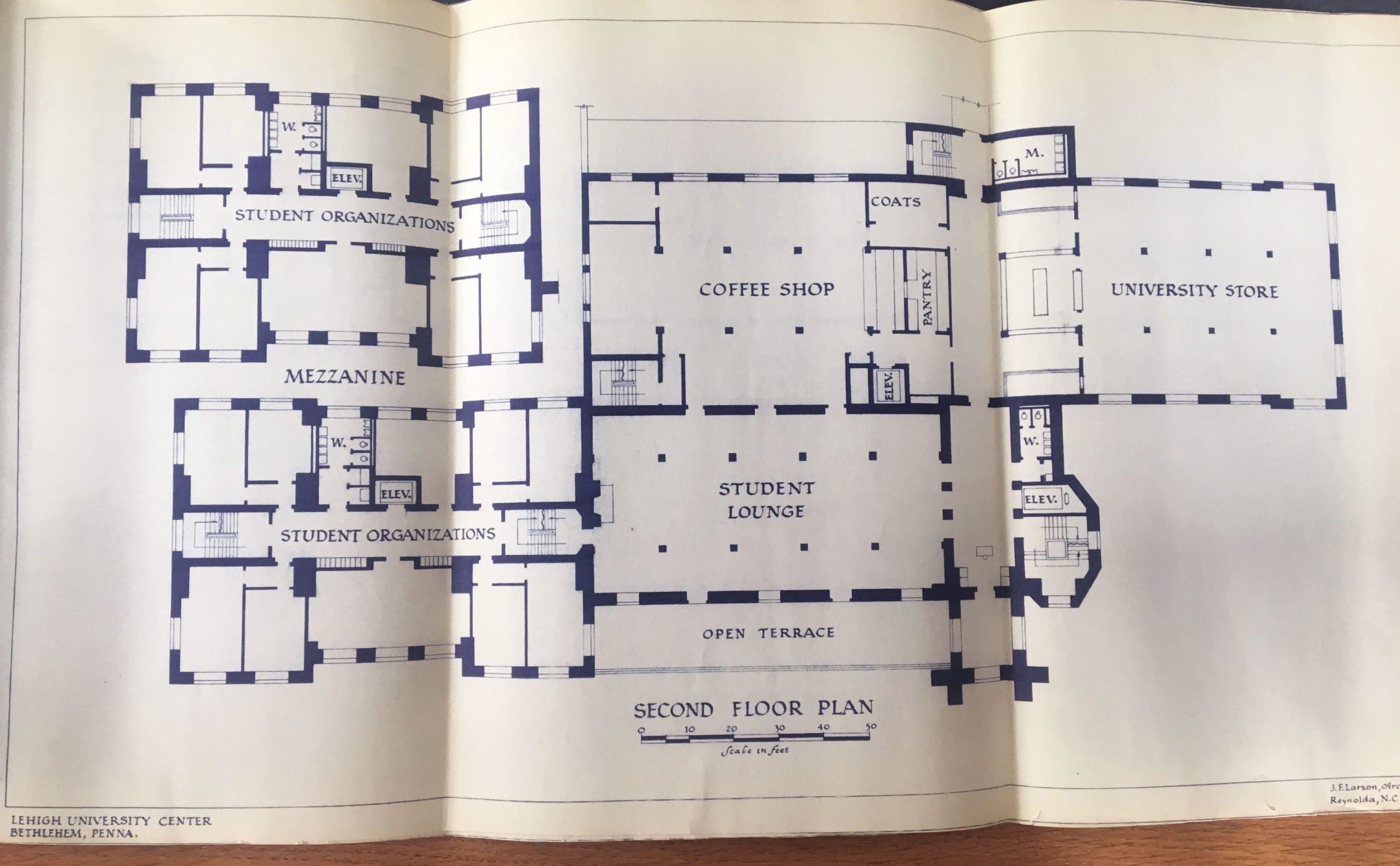
One further note here. The diagram on pg. 5 of the display at the top of this article is neither a rendering of the present U.C. second floor (being post the 1958 extension, that is), nor is it a representation of the second floor as is planned in the administrators present expansion/re-interpretation/deconstruction of 2020…. If, however, one eliminates the top left of pg. 5, being the rectangular area with the word “mezzanine” directly below it, then the architectural sketch would be an accurate representation of our present U.C., second floor.
The architects for the present project do not like to talk about this much, but their plan calls for the deconstruction of the entire 1958 extension, and so referring to pg. 5, this would mean tearing down the southern 1/3 of the building with the labelled rooms “Coffee Shop” and “University Store”.. (This latter area would be the bookstore until Maginnes Hall was built circa 1970.) What is also planned for extinction, in the present construction, is the 3rd floor Packer Hall Dining Room. The room w. the clerestory lighting will remain, but all the kitchen space along with many back hall dining rooms, will be torn down with the rest of the 1958 extension…
The class additions are hideous. One of the reasons I loved Lehigh’s campus so much was because of the old, Gothic buildings. Adding the glass to the UC is an atrocity. You would never see Princeton, Yale, Cambridge, Oxford, or other schools with gorgeous, ancient architecture deface their campus with a glass monstrosity such as the one proposed.
One of the reasons I have never donated to Lehigh is because of the idiotic renovation decisions they make. Who thought it was a good idea to put a diner with a grease vent in the library — a building with old, carved wood, a Tiffany ceiling, and a rare books collection?!
A benefit of going to a library is that great library smell — a frialator shouldn’t be part of that.
It looks like Lehigh is reinforcing my decision to not donate a penny. I will not support horrible choices that ruin the history and aesthetic of the campus.
The glass addition is hideous. One of the reasons I loved Lehigh’s campus so much was the old, Gothic buildings. Adding the glass section to the UC is an atrocity. You would never see Princeton, Yale, Cambridge, Oxford, or other schools with gorgeous, ancient architecture deface their campus with a glass monstrosity such as the one proposed here.
I have never donated to Lehigh because of the idiotic renovation decisions they make. Who thought it was a good idea to put a diner with a grease vent in the library — a building with old, carved wood, a Tiffany ceiling, and a rare books collection?! A benefit of going to a library is that great old book and wood smell — a frialator shouldn’t be part of that. I am embarrassed that my class is associated with that project
It looks like Lehigh is reinforcing my decision to not donate a penny. I will not support horrible choices that ruin the history and aesthetic of the campus.